
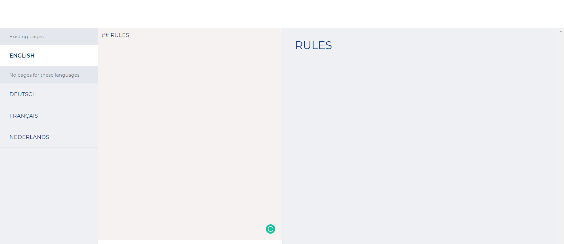
1.3 How to create a composer page
Composer pages introduce a wide array of flexibility to set up the pages on your platform in any way you want, allowing you to give them a great number of functionalities. The composer page design tool is an easy-to-use functionality and a hands-on approach to designing your pages yourself.
The composer page tool functionalities apply to all pages on your platform: homepage, built-in pages and all your composed pages you made yourself. These composer pages can be made from scratch from the control panel.
Via ‘Control panel’ -> Pages
Via ‘Composer pages’ -> ‘+Add composed page’
The following screen should appear in the control panel:
Click the button
The following menu will appear:
Name: Pick a name for your page. URL: Enter the internal web link of your composed page. Ex: ‘Composerpagetest1’ will become ‘/Composerpagetest1’. Icon: Select the icon of your choice by picking one from the fonts list. Copy the code from the list and paste it into the field. Ex: strivecloud-chest Description: Enter a description for the composed page | |
Use tabs: Enables the use of multiple pages within a parent page Header: Toggle on/off to enable/ disable your header on the page. Wide: Displays the page in a full width display, allowing the use of sections | |
Footer: Toggle on/off to enable/disable your footer on the page. Enabling this feature will drop down other settings
|
Now that you have created your composer page from scratch, you can start to design it any way you want. Click ‘view page’ on your page:
This will redirect you to your new page. Since there isn’t any content on this page yet, this page will be completely empty:
Fill your empty composer page with content by clicking :
The following screen will appear:
Change page settings: Allows you to adjust the settings of your composed page as you would set it up from the control panel.
Change layout: Allows you to drag and drop the page contents around to optimise the layout to your liking.
View page: Gives an overview of how the page would be displayed in its’ current state.
View mode: Swap between desktop and mobile view mode
Page contents
Here you can find an overview of all the different types of content blocks that can be added on the newly composed page.
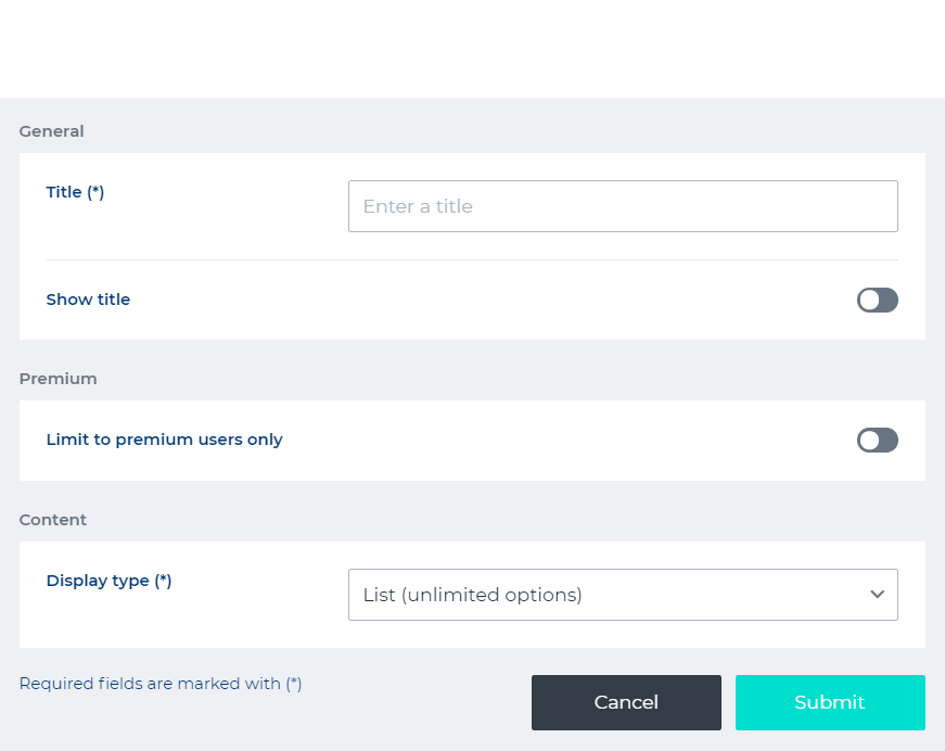
Every type of content has general settings and content specific settings. The general settings are the same for every type of content:
|
Badge
Display type: To display progress on achievements, you can select the badge type. You can choose between:
| Ex: a Badge block of the ‘Fully fill out your profile’ achievement, as displayed on the composer page. Tip: clicking ‘show all’ will redirect you to the achievement overview in the user profile. |
Button
This block allows you to create a button on the page, which can redirect you to any pages or functionalities the platform has to offer. External links can also be connected to each button. To set up the buttons, add the content in the button menu.
Type: Choose the type of button. Size: Determine the size of the button. Icon: Select a fitting icon to display on the button. (needs some explanation) Text: Insert a short bit of text to display on the button. Link: Insert an internal or external link to the button to redirect you to the actual destination of the button. Inverted: Enable this to invert the colour scheme of the button. Wide: Enable this to stretch the button across the full width of the block. | Ex: How a button could be displayed on your page. |
Campaign
A campaign content block allows you to display any of the campaigns you made on one of a composed page. Campaigns are used as advertisements for different brands and/or partners on the platform.
More info on how to set up campaigns can be found here:
Title: Show title: Toggle on to display the title in the block Premium: Toggle on to limit this content block to premium users only Type: Select an image or a video to display as your campaign of choice. Ad: Select which campaign you want to display Note: in order to dipslay a campaign on a composer page, you’ll need to select ‘Composer’ in the ‘Where to show’ setting when setting up your campaign from the control panel | 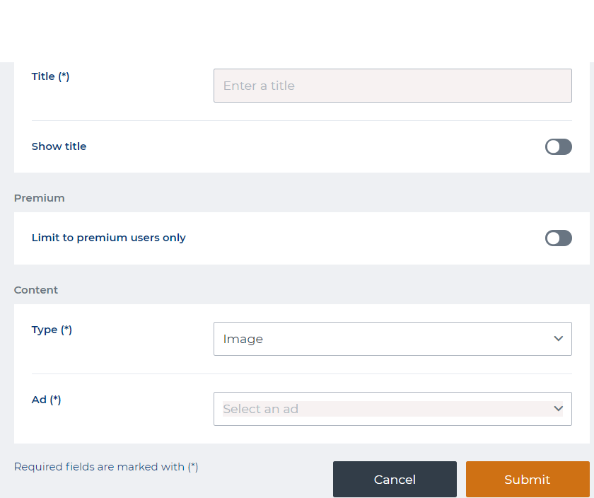 |
A campaign as displayed in a campaign content block, will look something like this:
Challenge an opponent
This block allows the user to instantly challenge an opponent to a league match. An active league is required in order for this block to be functional. Setting up a league can be done here.
More info on how to challenge an opponent can be found here.
Ex: a ‘Challenge an opponent’ block as displayed on a page
When the block is connected to an active league, you can start searching for opponents to challenge, as shown in the example.
Ex: the search bar for challenging opponents.
Code redemption block
This type of block allows you to redeem codes on the platform. Codes can be uploaded by means of a CSV file (excel, spreadsheet, etc…). The codes can be collected in any number of ways by the players like finding hidden words or a quiz, with the answer being the actual redemption code, etc…
Title: Insert a title for your code redemption block. Show title: Toggle on to display the title on the content block. Size: Determine the display size of this block; small, medium or large. Custom background color: Insert the supported color codes to set as a background for the code redemption block. These can be found in the Theming settings in here: 7. General | 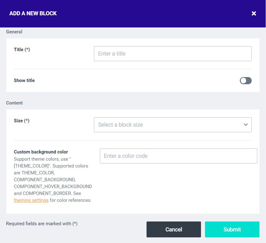 |
|---|
After you have set up the code redemption block, the block on your page will look something like this:
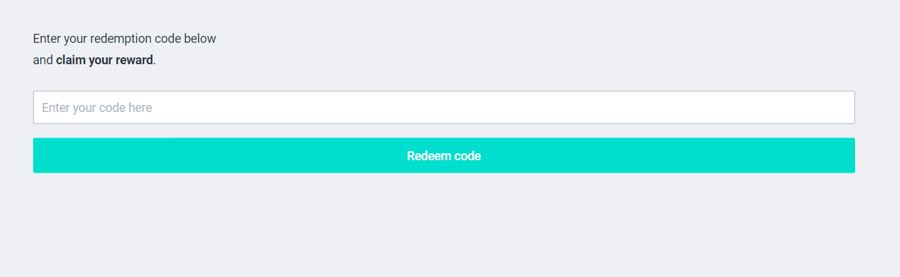
Just enter the code and click ‘redeem code’. When successful, the following screen should appear:
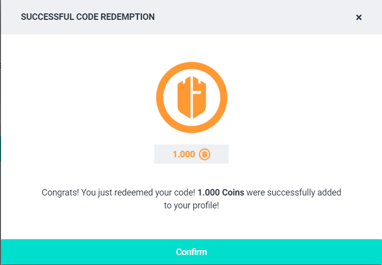
Click ‘Confirm’ to claim your prize.
Note: It is required to upload valid redemption codes in a cvs. file in order:
Via → Control Panel → Shop → Redemption codes
From the shop you can set up all requirements and settings concerning the functionalities of these redemption codes. More information about the shop can be found here:
Donation
You can include a donation content block on your pages. Allowing users to donate a certain amount of their currency for a certain cause or charity hosted on the platform.
Title: Give the cause of donation a name Show title: Displays the title when toggled on Limited to premium users only: Only available to premium users when toggled on Cause name: The name of the cause, as displayed in transaction details Type: Choose between a fixed a mount or a minimal amount Amount: Determine the amount of currency to donate Currency: Determine the type of currency to donate Content: Provide some additional information to the cause Button content: Type in the text to display in the button Use a background image: Upload an image to use as a background | 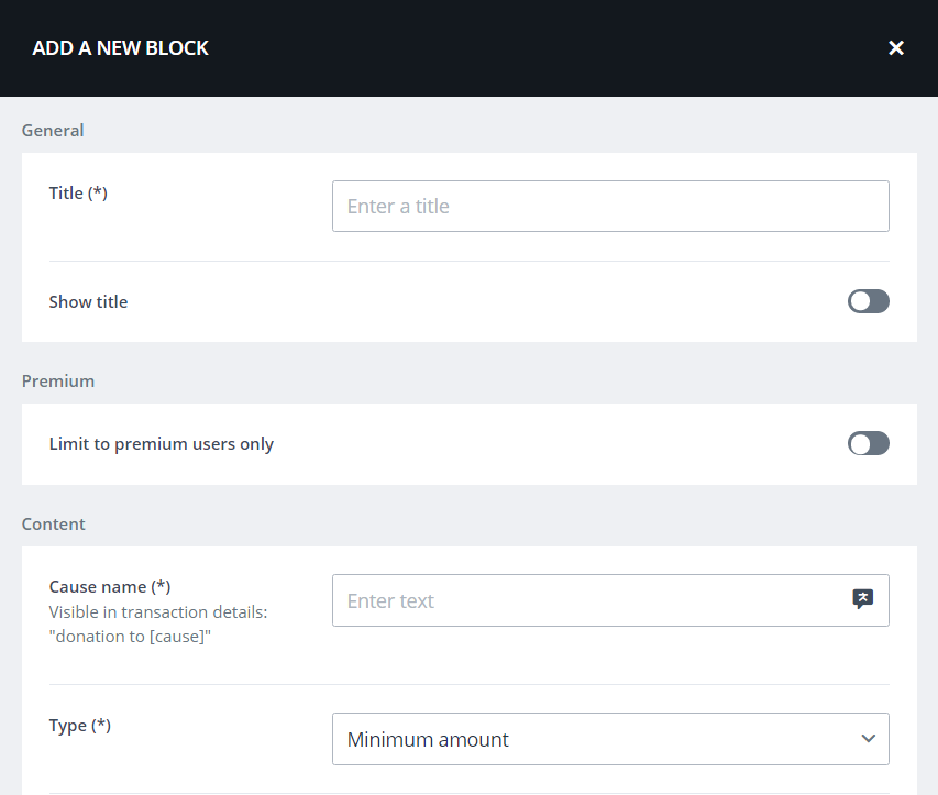 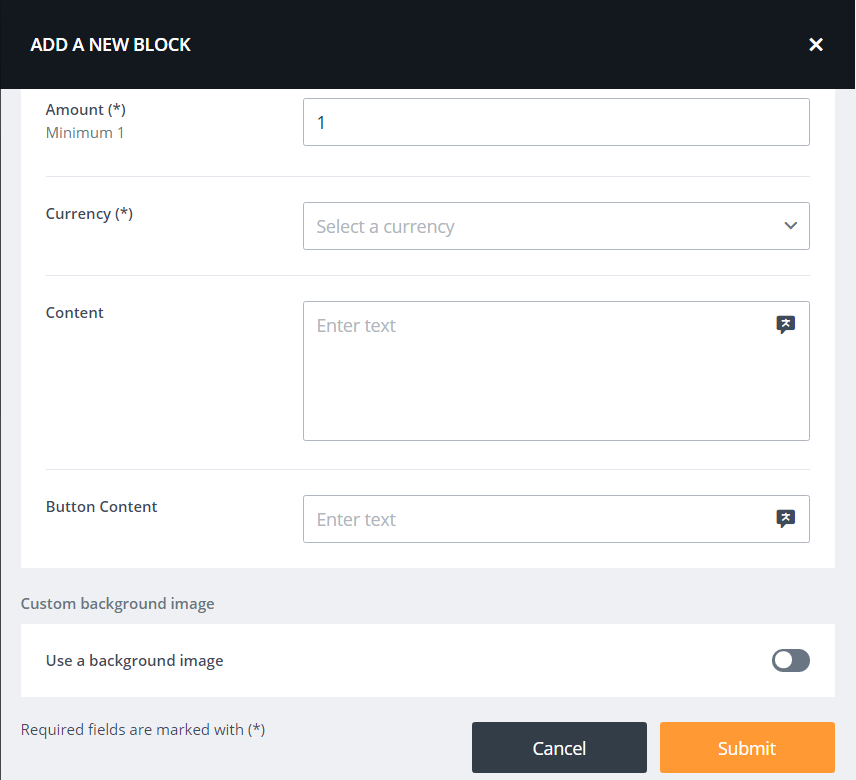 |
After you’ve set up the donation block, the block on your page will look something like this:

When the user donates the amount, the following notification will appear:
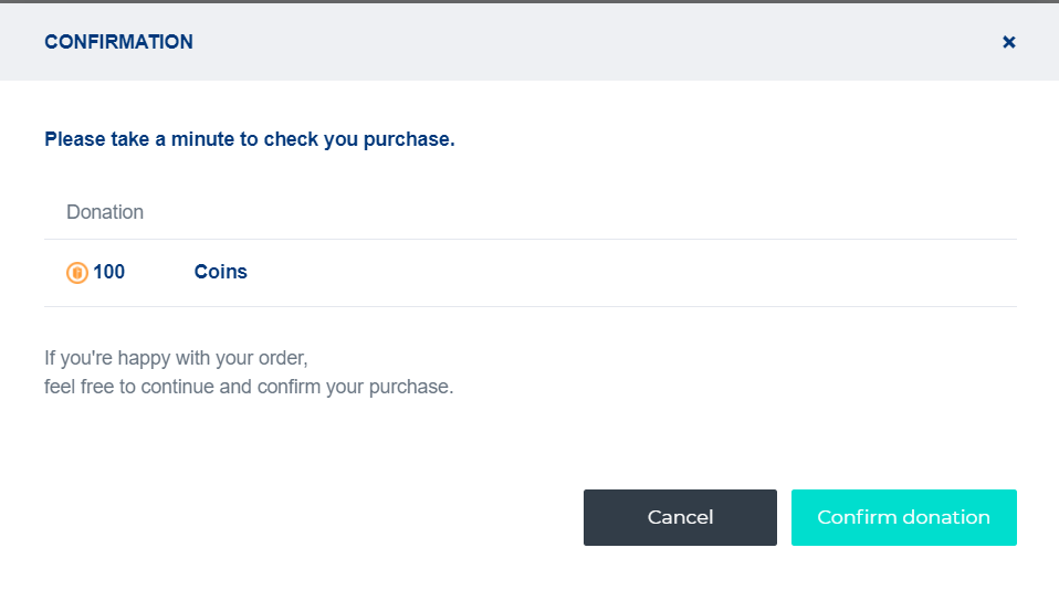
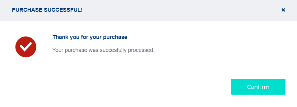
Confirm your donation and you’re done!
Featured product
You can put a product from the shop in the spotlight by putting a featured product on the composer page.
Title: Give the content block a name. Show title: Determine whether the title should be displayed or not. Type: Determine the type of product. Size: Determine the size of the content block for the featured product, small- medium - large. Banner background color: pick a color to display as a background, supported by hex codes. Product: Select the product from the shop. | 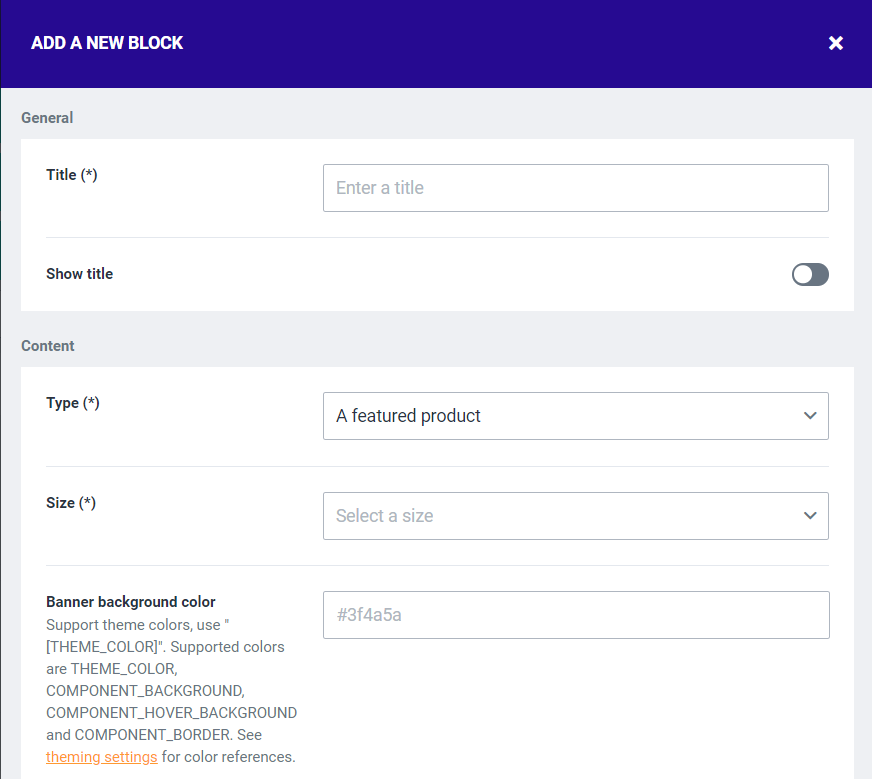 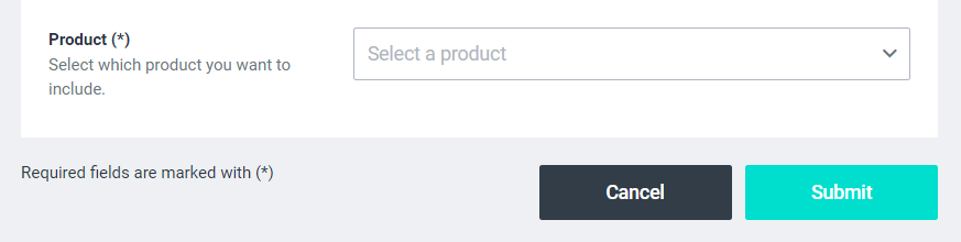 Ex. A featured product as shown on a composer page 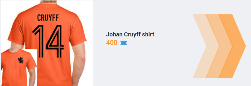 |
|---|---|
Gamble
To create a gamble feature on your page, fill in the content list as shown in the screenshot Title: Submit a title for the gamble block Show title: Toggle on to display the title Premium: Toggle on to limit this gamble to block to premium users Display type: Choose a display type
|  |
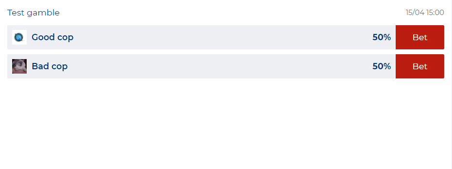
After clicking ‘Submit’, the following block will appear on your page | |
Set up the gamble in the ‘Create gamble’ menu. Title: Insert a title for your gamble feature. Starting date & time: pick a date and specific time to start the gamble Currency: select the currency that will be at stake for this gamble. Max. amount to bet per user: determines the maximum amount of currency which can be bet per user. Percentage to take from profits: The percentage of currency that will be redirected to the ‘house’ (host of the platform) after the bet. Use CRON’s to close the betting: When enabled, the gamble will close automatically instead of manually. (When enabled via integration with an external partner.) Premium: enable to link the poll to a premium package | |
When set up properly, the next block will appear. Which means you are still required to submit the options on which users can bet. | |
Click the ‘’icon, to open the following screen:  Open betting: allows you to open or close the betting manually Refund bets: Refund the amount of currency at stake back to both players, closing the bets Show all bets: Provides you with an overview of all the bets made so far. Add option: Add the different options on which users can bet. Enter scores: Allows you to determine the end results of the gamble manually. |
When fully set up, the gamble block could look something like this:
Image
Create an image block on your page, select a display type:
Slide duration seconds: Decide how fast you want to transition to the next image. | |
Multiple images in collage, slideshow when opened: Puts multiple images in a collage to display in the block. The amount of images that can be previewed in the block can be determined as shown in the menu here.
| |
When you have chosen your display type of choice, you can drag and drop your images in the block: |
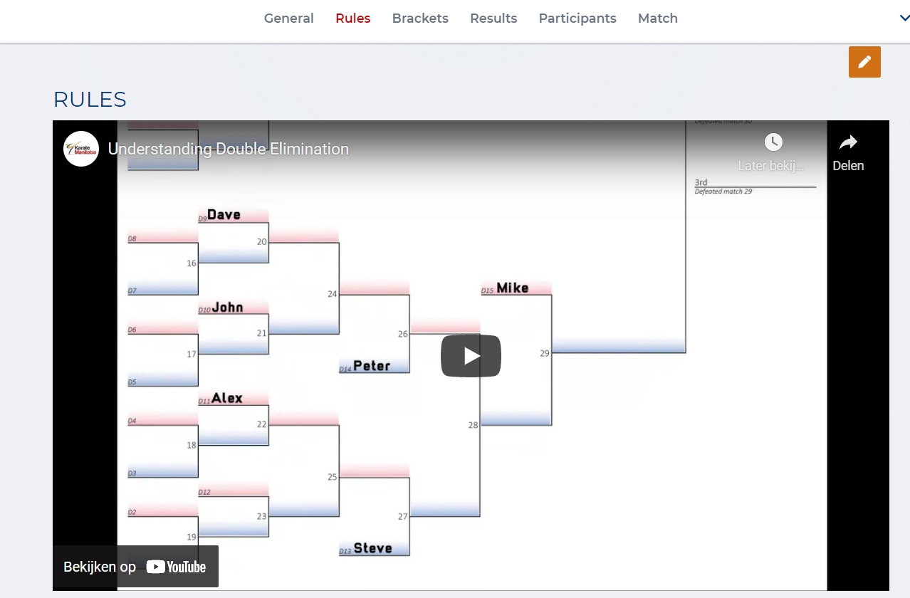
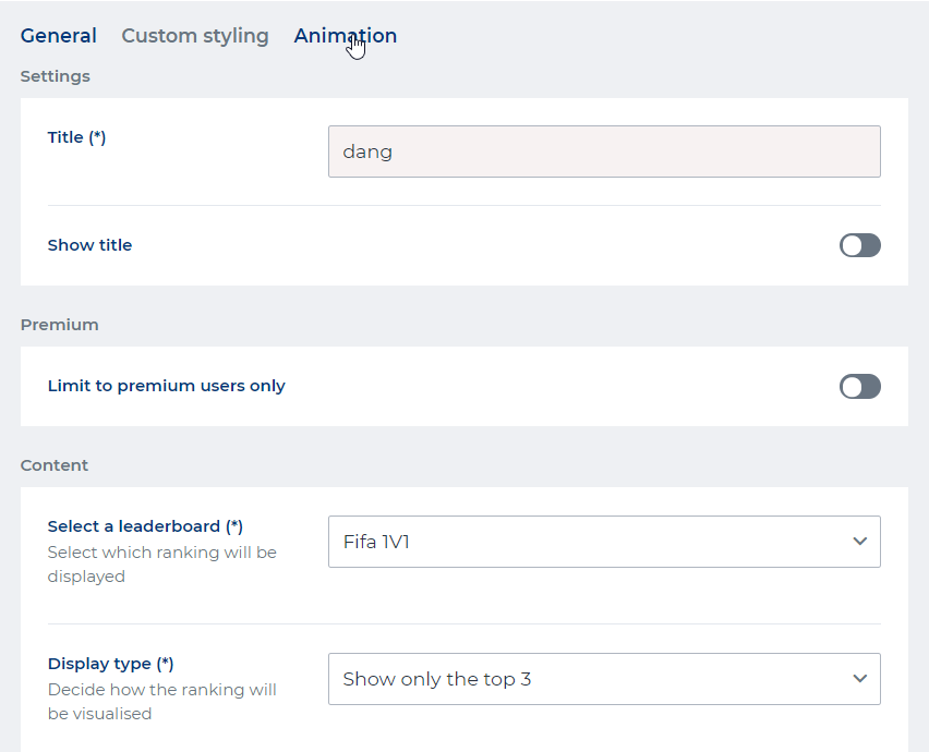
Leaderboard
When you have set up the leaderboards for your platform here, you can display them on your page by creating a dedicated content block for leaderboards.
Select a leaderboard: Select which ranking (of a game/gamemode) will be displayed Display type:
|
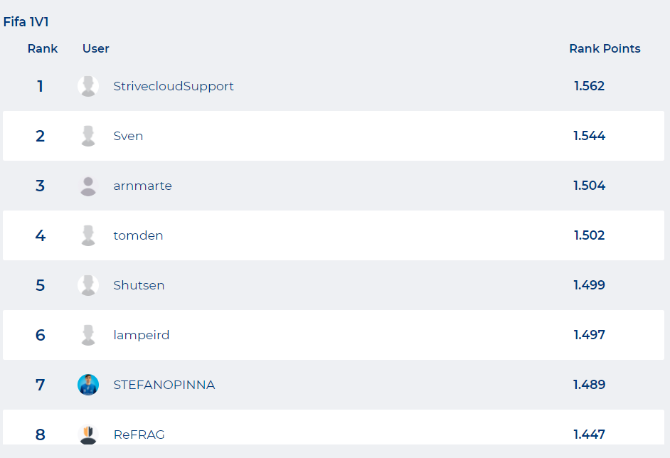
After you’ve set up the leaderboard, the block on your page will look something like this:
Leagues
When you have set up the leagues for your platform here, you can display them on your page by creating a dedicated content block for your leagues.
Filter mode: Select specific league: select upcoming leagues to display in this block Display mode: select the size of this block (list format, small or large) | |
Filter mode: Select games:
| |
Display on the composer page |
News
You can add a content block on your page, displaying previews of news articles you published on the platform.
News articles are added via the News section of the Control Panel.
Visualisation: Determines whether you want the last article to be displayed, or to display a slideshow of the last few articles published on the platform (max. 5). Filter: Every news item that you upload is provided with some tags. Selecting the tags determines which news items will be shown in your content block. Show tags: Enable this button to display the tags on the news previews. Show button: Enable this button ‘Read more’ to display an action button to redirect you to the article. |
Poll
Polls are used to gather input and opinions from your user community on certain topics. Whether these are just for fun or to be used as actual valuable information for your own community is entirely up to you.
To add the poll content, click the ‘Create poll’ button. | |
Description: Put the question or statement to which the poll should apply in here. Options: Insert all the possible options to answer the statement. Multiple answers: Toggle to allow the possibility of giving multiple answers to the statements in the poll. | |
The eventual result of this setup should look something like this |
Raffle
Raffles offer the users a chance at winning shop items or other unique prizes. When you have set up a raffle for your platform, you can display them on your page by creating a dedicated content block.
Display type: Show a specific ongoing raffle
| |
Display type: Show finished raffles
| |
Display type: Show ongoing raffles
| |
When you have finished the set up of the raffle, the raffle will be displayed on your composer page. | Ex. A raffle on your composer page |
Section
Section blocks allow you to make spaces in which you can make your own custom designs by adding text, images, etc. Basically creating open content blocks to fill with other content blocks. You can even insert backgrounds and videos. This type of block delivers the possibility of adding some creativity to your composer pages.
More information on how these sections can be used to their full potential can be found here.
Section id: Enter the id of a section here. No spaces can be used, ex: section-x-id) Content width: Determine the size of this section.
Custom background color: Determine the colour of your sections. Supported by hex color codes (ex. #000000) | |
Use a background image: Enable to insert a background image in this section.
| |
Use a background video: Enable to insert a video in this section.
|
Sections allow you to create content blocks within content blocks. By creating a section on your composer page, you basically create the main content block in which you can add other specific content blocks of your choice. Offering great flexibility in function and lay-out.
Once you have created the section, click the button.
This redirects you to the space in which you can start adding other content blocks. Every type of content block mentioned in this article can be used as such. | |
Pick any number content types you wish to add to this section. | |
When you have selected the content you want to include in your section, you can rearrange them in any order you want. Providing you with lots of layout possibilities. Important: you can change the size of every content block by clicking the arrow in the bottom right corner of the content block. | Press the ‘change layout’ button.
Shown: Arrow on content block to adjust size. |
When you are satisfied with your layout, don’t forget to save your settings. | |
When you have set up the layout to your preferences, the section could be looking something like this. | Ex. A section after the layout has been adjusted. |
Slider
Sliders are a content block, often used as headers, allowing you to upload multiple sections within a single section through which the user can ‘slide’ to display these .
Time between slides: Determine the amount of seconds each image appears. | |
After the set up, the slider will still be empty and will look something like this. Click the ‘+ Add a slide’ button. | |
Insert the sections in the sliders by setting these up similar to the sections’ setup. | |
When you have added a section within your slider, you can add another one. Click the ‘Manage Slider’ button. Click the ‘+ New slide’ button to add the next section to your slide. | |
A finished slider block could be looking something like this. | Ex: A slider with sections |
Spacer
Spacers are blank spaces you can drop onto your composer page or section block to drag around. These spacers can be adjusted to any size you want, giving them the flexibility to utilize them for creative or practical purposes when setting up your layout.
Tip: Spacers are great to help you design your layout in sections!
Stat leaderboard
A stat leaderboard block allows you to connect a leaderboard display to any stat of your choice. More information about stats and achievements can be found here.
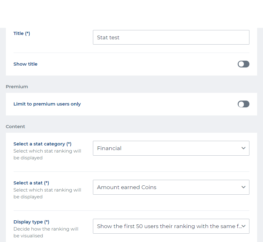
Title: Give the leaderboard a title Show title: Displays the title of the leaderboard when toggled on Premium: Only available for premium users when toggled on Select a stat category: Select one of the categories available for stats Select a stat: Select the stat you want to display in the form a leaderboad Display type: Select the preffered display type
|  |
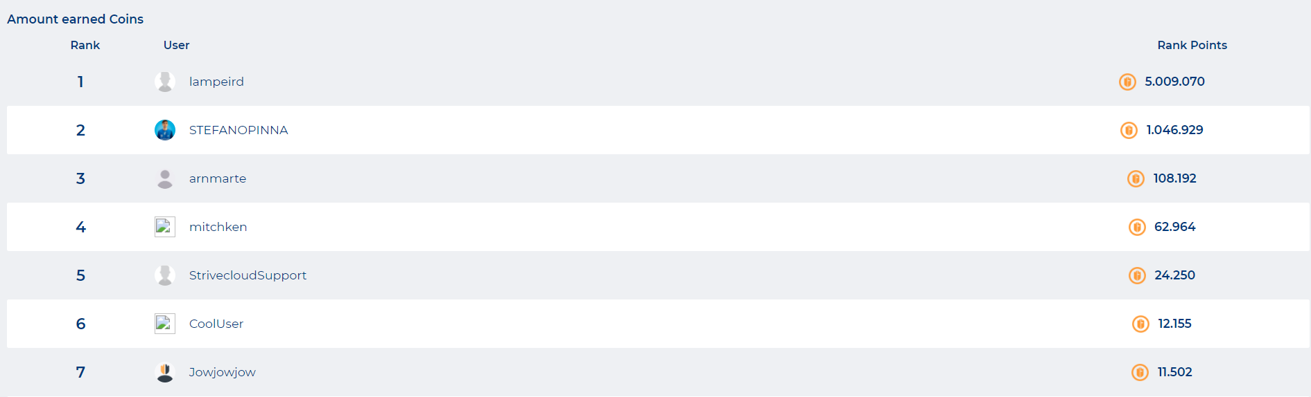
After you’ve set up the stat leaderboard, the block on your page will look something like this:
Text
This content block allows you to display bits of text on your platform.
Text: Enter the text you wish to display. This text can be formatted by using markdown and/or HTML, allowing you to design your texts in a more proficient manner. App - Show as card-like block: If turned on, this block will be wrapped in a white block with a shadow. Only active on mobile. |
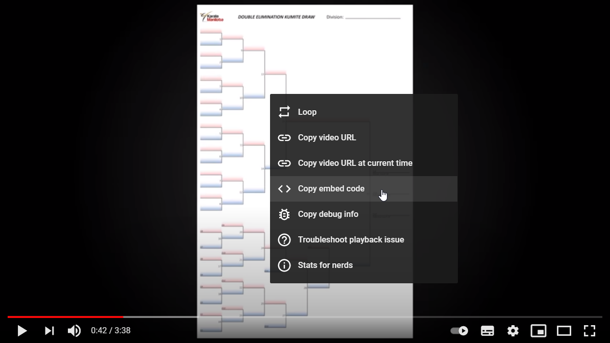
Embed videos within a text block
In text blocks you can directly attach Youtube video via the insert text screen.
Now copy the embed code of the Youtube video by right-clicking the video display frame:
Paste the embed link in the text input screen:
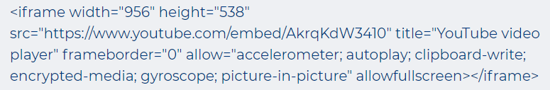
Delete the iframe content in the embed and add the embed prefix ‘/i/’, resulting in this:
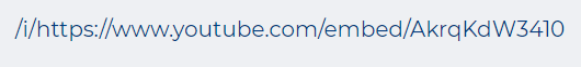
You have now successfully added a Youtube video.
Timed Challenges
Timed challenges are achievements which need to be completed within a certain period of time. After you have set up some timed achievements, you can display these on you composed page or within your sections.
Challenge type:
Challenge to show: Select which timed achievement you want to display | |
Display on the composer page |
Tournament
When you have set up the tournaments for your platform, you can display them on your page by creating a dedicated content block for your tournaments.
Filter mode: Select specific tournament: select upcoming tournaments to display in this block Display mode: select the size of this block (list format, small or large) | |
Filter mode: Select games:
| |
Display on the composer page |
Twitch stream
This allows you to incorporate a Twitch streaming channel on your page, accompanied by the chat window if you wish.
Twitch channel: To display the stream on your page, just copy the URL in the field. Show chat: Enable to display the Twitch chat windom next to the stream. | |
Display on the composer page |
Animations on composer blocks
After adding a content block of your choice, you can add animations to the display of each content block by editing it. From the composer page tool, click the pencil icon:

The following screen will appear, presenting you the ‘Animations’ submenu:
In the ‘Animations’ submenu you can set up the different kinds of animations and how they interact with the content block:
Animation type: Select which type of animation you want to use. Animation repeat: Select wether the animation will be repeated or not. Animation duration: Select the duration and/or speed of the animation. Submit a number in milliseconds (200 - 2000). Animation delay: Set up a delay before the animation start. Submit a number in milliseconds (5 - 1000). Animation easing: Submit the speed of the animation over time. Easings allow you to add a natural flow to the display of your animation. More info about the different types of easings can be found here: https://easings.net/ | 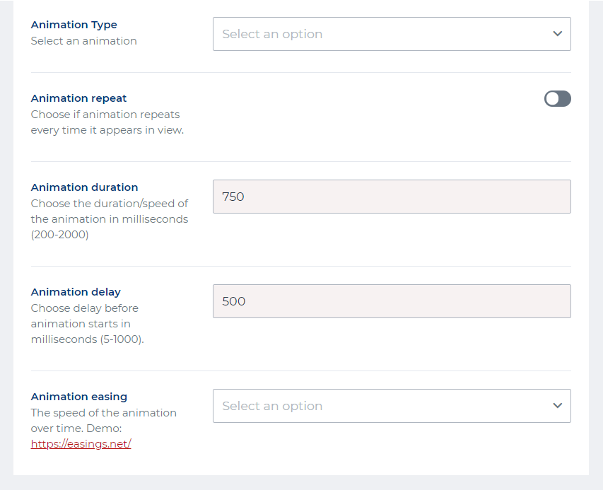 |
|---|
Animations types
A great number of animations are available to add some flavor to content blocks. Below you can find an overview of the different animation types:
Fade
Slide up
Slide down
Slide left
Slide right
Zoom in
Zoom out
Flip up
Flip down
Flip left
Flip right